News + Inspiration
Crafting the Art Experience in Downtown Asheville

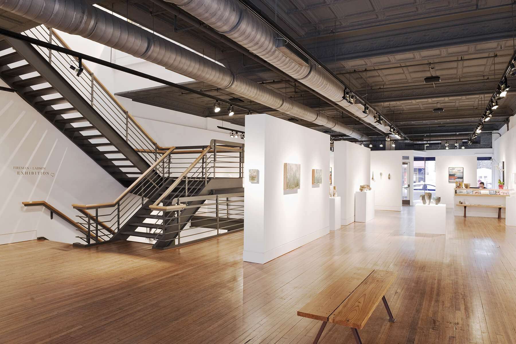
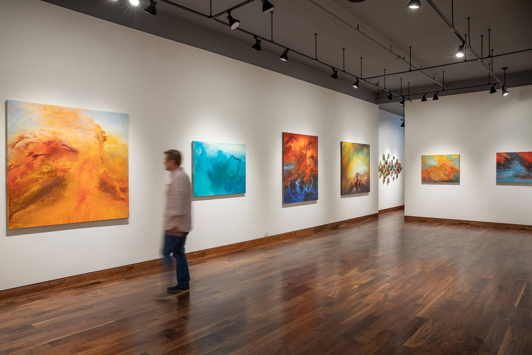
Interior of Momentum Gallery located on Broadway Street.
In some cases, a gallery or museum stands as a work of art itself, such as the MOMA and Guggenheim in New York. In a city like Asheville though, which has managed to maintain so much of its historic architecture dating back to the glamorous Jazz Age, creating an inspiring space in which to showcase art presents a different sort of challenge: adaptive reuse. It’s a challenge that involves sometimes large-scale modernization of mechanical systems required of a modern art gallery and a floor plan that breathes light and ample space into sometimes 100-year-old buildings.
Our team at Altura Architects has been behind the creative rehabilitation of several of Asheville’s preeminent art galleries, including Blue Spiral 1, Southern Highland Craft Gallery in Biltmore Village, Center for Craft, and most recently, Momentum. We’ve received a Griffin Award from Asheville’s preservation society for adaptive reuse for three of them, with Momentum up for consideration this year. Here, we offer a down-to-the-studs look at what it took to rehabilitate some of the city’s most vivid art spaces. Not unlike the potter or furniture-maker, or thousands of other artisans working in this region, it’s a creative process that blends art and functionality.
What’s Unique About Designing An Adaptive Reuse Art Gallery?
When it comes to creating a gallery in an existing building,“there’s the SoHo model, where you take a beautiful old building, paint it white, and put up art, and then there’s the architectural approach,” says Chuck Krekelberg, who’s been on our architectural staff for over 15 years and has been involved in every one of our gallery projects. The difference is considering the essential nature of the existing building, and working with what you have that is both practical and inviting. Adaptive reuse projects have the added bonus of being inherently more sustainable than new construction because they capitalize on areas that have already been developed. The challenge lies in updating the building for modern life while maintaining the layered history of the building.
In gallery design, lighting strength and temperature, wall surface and finish, and creating ways to hang and rehang artwork are all super critical. In addition to displaying art, partitions also serve to help filter light and break up the space, allowing for more intimate and less intimidating interactions with the art. The back of the house areas are equally important, as adequate room for storage, packing and shipping, and office space are all necessary. But perhaps the aspect at the core of most gallery projects, and is different from a museum, is the retail component. The display and sale of art is, after all, the purpose of a gallery. Here’s how we’ve created that welcoming gallery experience for each project through adaptive reuse.
Momentum Gallery at 52 Broadway Street
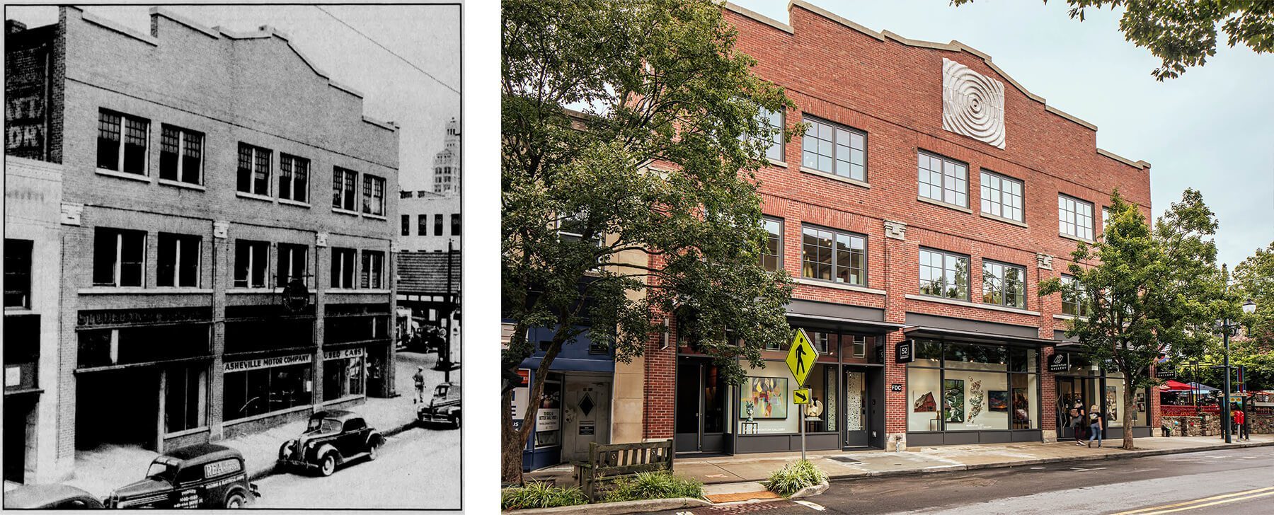
52 Broadway Street in 1943 and today.
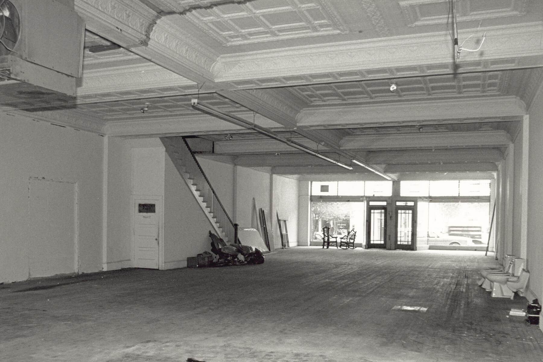
The three-story building at 52 Broadway Street has been a fixture in Asheville since the 1920s. We started with major structural improvements for safety and accessibility, and added a solar array on the roof to power the gallery, before getting to the real eye-catching aspects that draw visitors in—beyond just the artwork. For starters, ever notice that you can’t see your reflection in the wall of glass spanning the storefront? That’s because we used a laminated glass with an anti-reflective coating in order to balance visibility with UV protection. Inside, we opened up the space by raising the first-floor ceilings and reducing the number of columns (to which we added a sleek mirrored tile). The thoughtfully placed partitions throughout help filter light while also providing flexibility for displaying artworks of various sizes. And the grand walnut, steel, and glass staircase is centrally placed to draw visitors to the gallery rooms upstairs. Even the walnut floors and other materials were thoughtfully chosen; as familiar elements in a home, these subtle nuances can help the customer better envision the art in their own home.
Blue Spiral 1
With this long-time downtown establishment for art, we met similar challenges with having to renovate a very old building, though had the added challenge of luring visitors to explore on three levels that fit together like a maze. The upstairs spans two buildings, with the main level taking up a building and a half, and the below-ground level even smaller. Confused? It is an old building. The solution was a steel staircase that connects all three levels and brings clarity to the confusion. The flow of the space opens up and generous clerestory windows at the top of the stairs bring natural light down into the building, revealing one striking work of art after another.
Before and after images of the main interior space at Blue Spiral 1 that shows the added custom staircase.
Southern Highland Craft Gallery
With soaring Palladian windows and 25-foot ceilings, this gem of a building in Biltmore Village, opened as a bank around 1928, but had fallen into severe disrepair by the time the Southern Highland Craft Guild took it over in recent years. Waterproofing, lead paint removal, asbestos abatement, structural upgrades, and exterior rehabilitation were necessary to start. The added challenge was the cavernous ambiance presented by the two-story ceiling; it was a lot of noticeable wasted space and not a perfect fit for retail. To meet the challenge, we worked with local artisans and subcontractors to build custom display cases of various heights and installed a pulley system for displaying quilts high on the wall, utilizing the mezzanine.
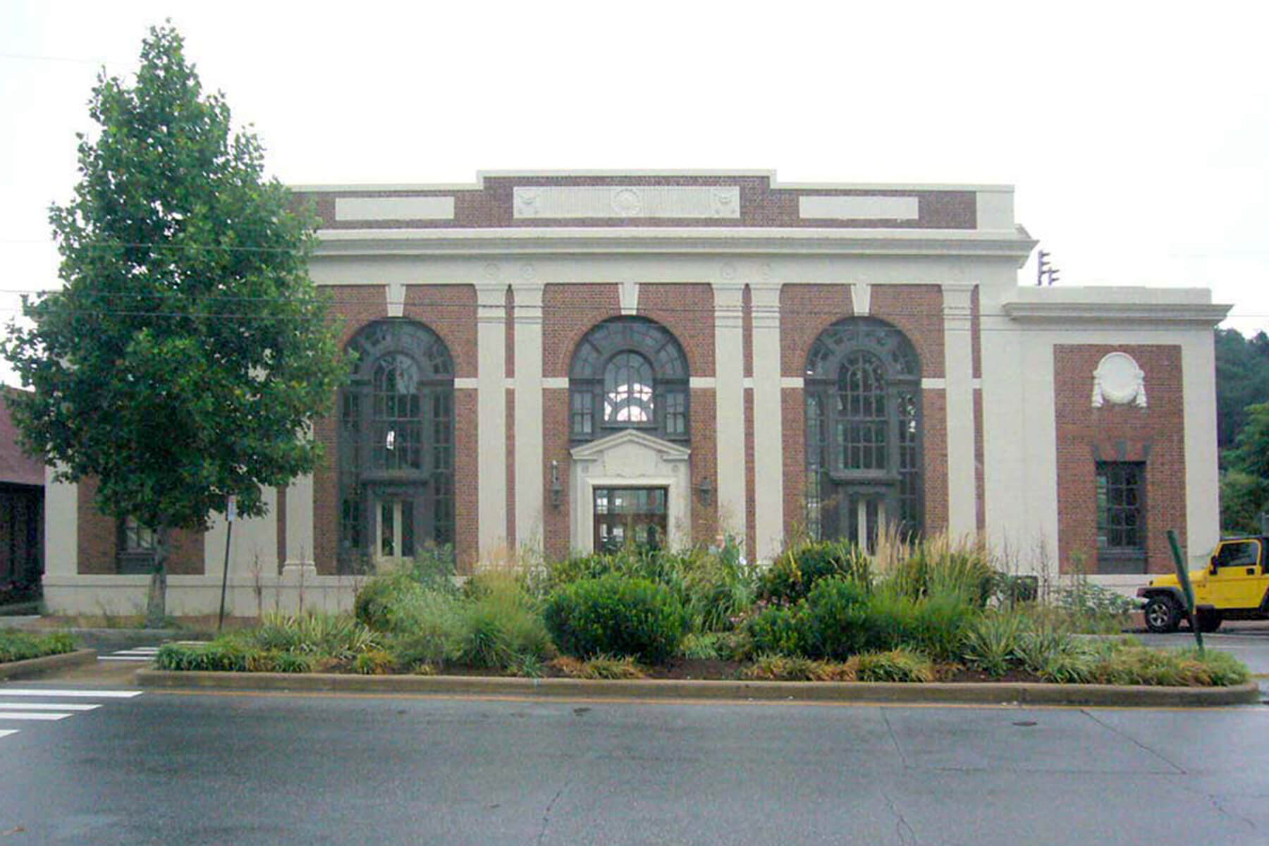
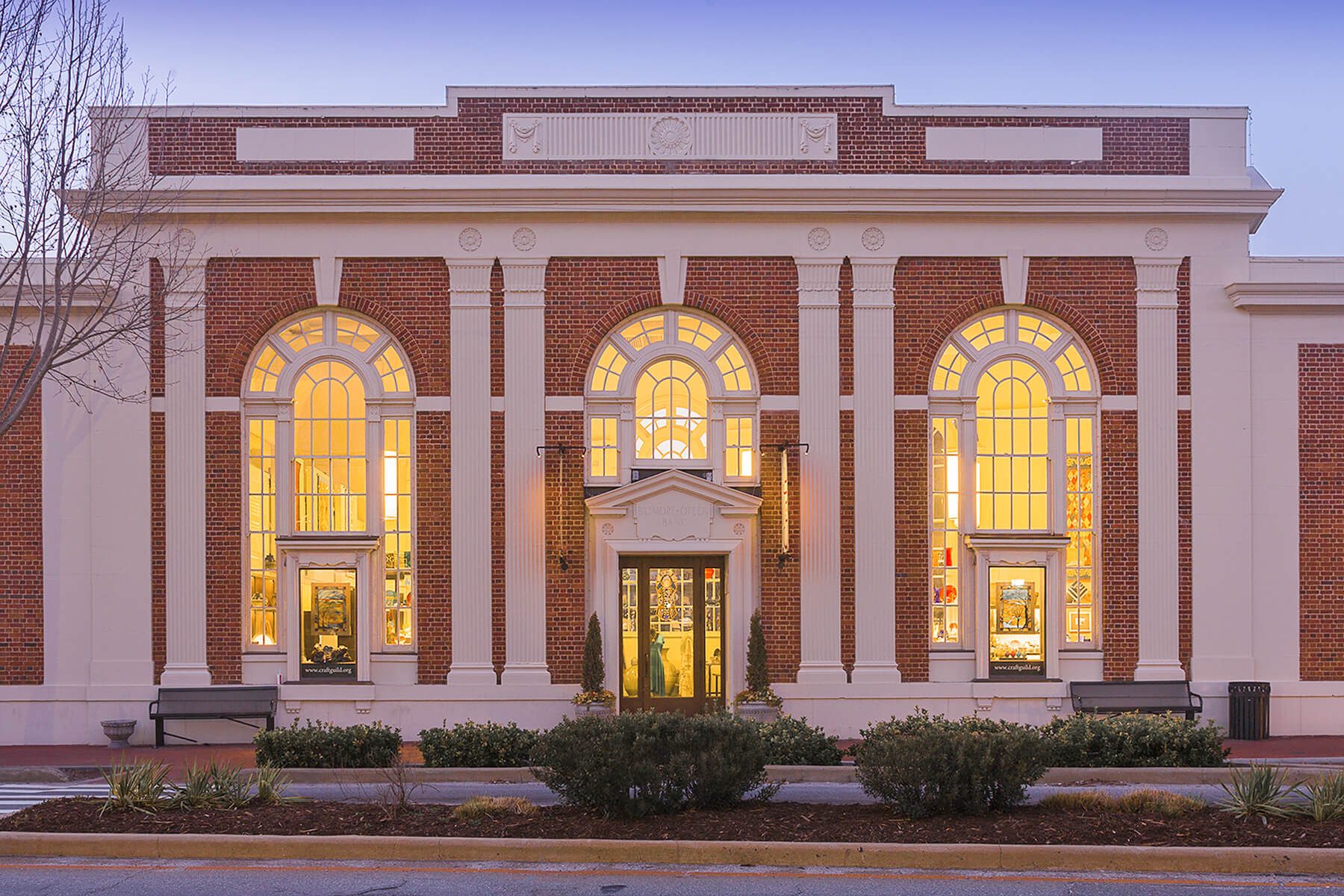
26 Lodge Street before and after our rehabilitation in 2014.
Center for Craft
When the Center for Craft purchased its historic industrial building downtown, it sought to create an innovation hub that is both a museum and coworking space. Though the building used to house a multi-story automotive shop, this incredibly stout concrete building didn’t have the necessary load-bearing capacity to meet safety standards without destroying the beautiful mushroom columns at the basement level. “A car is a heavy thing,” explains Krekelberg, “but when you look at the square feet it takes up, the load is much less than if you were filling the space with people who are moving, dancing, jumping.” We worked with the city and engineers to reduce the maximum occupancy and retain the building’s historic features. The 16,000 square feet of space now includes a ground floor museum, with versatile event spaces, private and open offices, meeting rooms, and a catering kitchen on the floors above. Akin to how the Center for Craft examines the future of time-honored craft traditions, the rehabilitation beautifully bridges the gap between past and future.
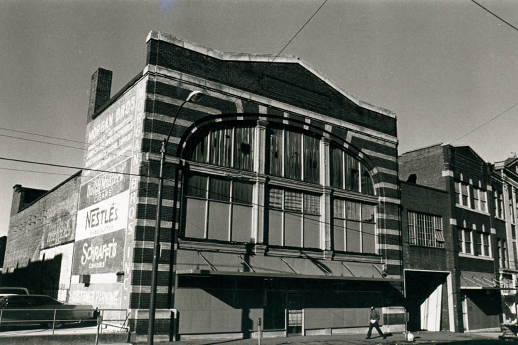
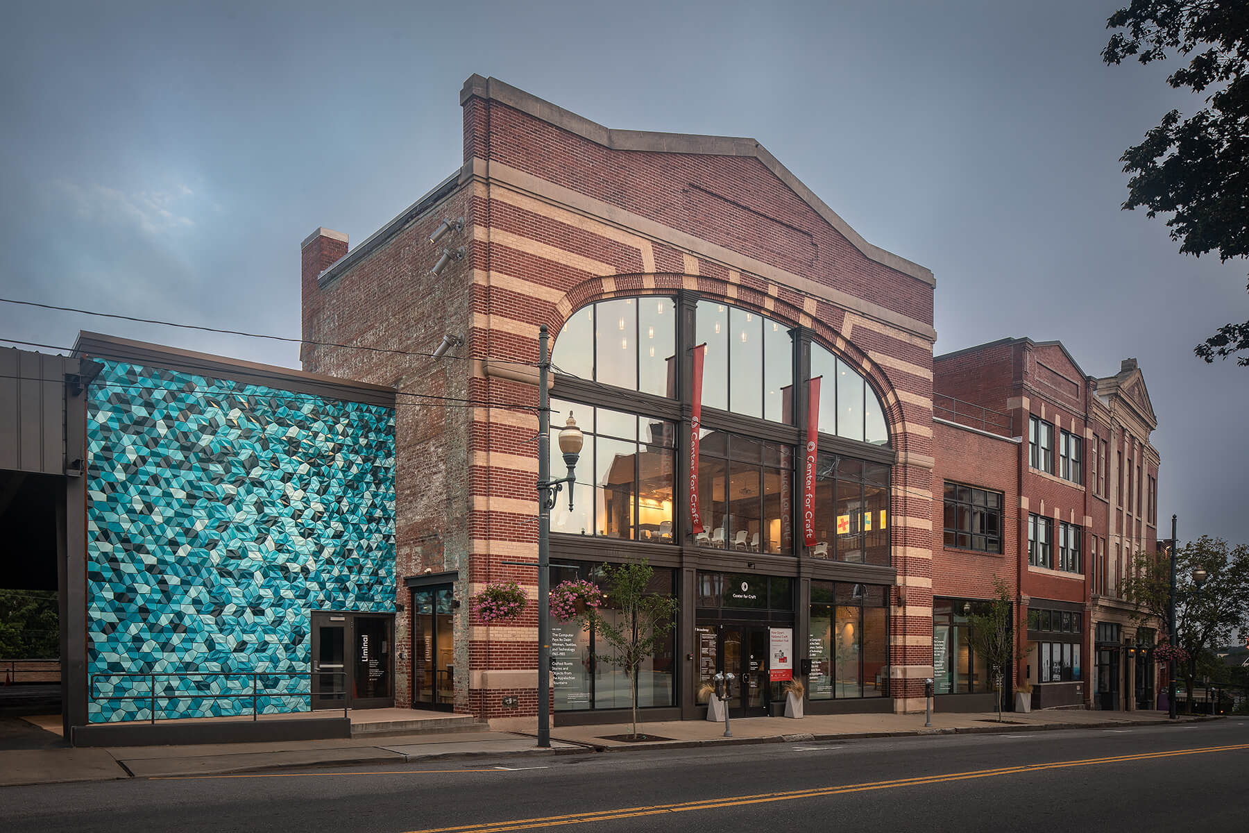
See other gallery and museum work we’ve completed around Asheville including Benjamin Walls Fine Art Gallery, Tracey Morgan Gallery, New Morning Gallery, and an interim renovation at Asheville Art Museum before their major overhaul in 2020.


